Spotify International Pricing Index
07 May 2014The Big Mac Index for Spotify Premium pricing
See the project here: Spotify International Pricing Index
Just after moving to Malaysia it shocked me how big the price difference was between Spotify Premium in Denmark and Malaysia.
One of the main reasons for the large price difference can be found in the particular catalog size in each country. I scoured the web looking for a way to get the total number of tracks available for each country, unfortunately Spotify doesn’t seem to make this data publicly available.1
I’ve always wanted to do a simple project with data visualization with D3.js, so this a perfect opportunity to play around with that.
I wanted to replicate the charts from Big Mac Index, but with simpler interaction. The goal was basically a simple Javascript-generated infographic. I tried to match the styling of the Spotify OS X and iOS app as best as possible with similar colors and fonts.
Getting the pricing data
I wrote a simple little script in Node.js that crawls all the individual country pages for the pricing info. It then adds a little more relevant country info to each country from restcountries.eu and lastly converts the local price to USD with the help of money.js. Check it out on GitHub: spotify-crawler
Luckily Spotify keeps a nice and simple list of all their available countries. They also don’t force a location based on IP which would make crawling much harder without the use of proxies in different countries.
I exposed a simple API with all the countries on Heroku if you want to look at the data: http://spotify-pricing.herokuapp.com/api/
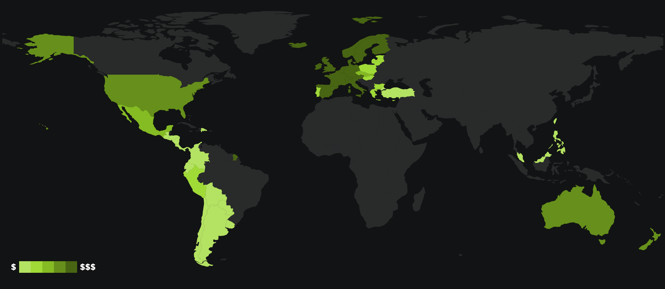
World map choropleth
I started out creating a map from the ground up, but quickly discovered datamaps.js.2.
The datamaps.js library includes features like hover, popup, legend, etc. – all features which I would have had to reproduce if I followed the tutorial.
I hit some limits in the use of the library and had to make some edits to the main source file - I’ll try contributing the changes back to the source.

I associated the different fill colors based on which price-difference quantile each country fell into – still not convinced that this is the most correct way of doing it but the result looks reasonable. Getting a specific quantile with D3.js is as simple as:
var sortedDifferences = _.map(_.sortBy(countries, 'priceDifference'), 'priceDifference');

var quantile = [
  d3.quantile(sortedDifferences, 0.2),
  d3.quantile(sortedDifferences, 0.4),
  d3.quantile(sortedDifferences, 0.6),
  d3.quantile(sortedDifferences, 0.8)
];
Assigning a fillKey/fillColor can then be done by comparing each priceDifference and observe which quantile it falls into.
The fill colors themselves are calculated with the small Javascript library tinycolor.js which provides powerful color methods like .lighten and .darken – you may have seen similar methods in Sass.
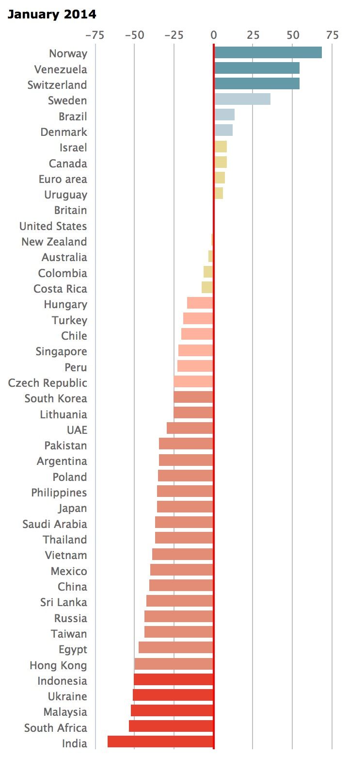
Bar chart with negative values
The original chart from The Economist that I was trying to reproduce:

This was the first chart I started working on, since it was my first time working with D3.js it was also the chart that took the longest to replicate.
I followed this brilliant example from Mike Bostock showing how to build a simple bar chart with negative values.3
I added some additional text elements and labels, but the end result is pretty close to the example.
Scatter plot
I originally didn’t plan on reproducing this chart, but after making the first two charts I could just create this one as well - a fun little challenge. I started off with yet another great example from Mike Bostock.
GDP data varies widely between different sources, be it IMF, CIA or World Bank. I ended up using the GDP per capita, PPP (current international $) data from World Bank, and their API was fairly easy to use. All data are from 2012 because it was the latest year without estimated numbers in the World Bank API.
5 countries still returned null from the World Bank API: Andorra, Argentina, Liechtenstein, Monaco and Taiwan. These countries are not shown in the scatter plot chart. The CIA list of GDP (PPP) per capita does contain these countries, but the reported numbers are from different years.
This whole project gave me an opportunity to dust off some of the math and basic statistics I had learned years ago – and never really used since. I was about to create my own trend line calculation when I found yet another example from Mike Bostock showing how to calculate a trendline.
Wrap up
I’m currently paying for the most expensive Spotify Premium plan in the world when converted to USD.
So will I be making the switch? Probably not, I still want to listen to Danish tracks which aren’t available in the cheaper countries like Philippines and Malaysia.
Check out the GitHub repo for the project here: spotify-pricing
Further additions that I want to implement are recording price changes over time, and automatically adding new countries as Spotify expands further internationally.
-
If you know any way to get this data, please let me know. ↩
-
There is a great tutorial on how to create maps with D3.js here: http://bost.ocks.org/mike/map/ ↩
-
Mike Bostock is the creator of D3.js ↩
Update 1: Corrected small typo spotted by @nikreiman, thanks!